Category Archives: Web Design

Shop of the Month

This was in my inbox today, via the Spreadshirt Newsletter.

Shop of the Month: focusfodder

Accentuating the positive?

LibDems is the hangout spot for the liberal democrat blogs of Britian. In case you thought you were alone, currently over 50 bloggers are in the arena. With topics ranging from: Brit monarchy, Canadian elections, building bridges and, sometimes, even fighting hard (as Simon from Inner West posted “Ambition is a reality of politics, and a good thing. We can’t always be nice and fluffy. We might actually want to be successful.” I like his style. Speaking of which, you can wear your LibDem thoughts via this lovely focusFodder shop.

Bird of Liberty Masterclass

Having seen some of the local party websites, I thought that I would give a Libby Masterclass.
I personally use Paint Shop Pro to create my images, and this tutorial will be based on it.
The first problem I come across are people using images which are resized using the height and width attributes, which leads to images like the two on the right.

You should always resize your images in a graphics package, and use those images. Even if it means creating one-offs, it only takes a few seconds to resize an image and you’ll save on bandwidth as people won’t need to download such large images.

The next problem that I come across is people using transparent GIFs.
Whilst the first image works fine on a white background, we come across problems on a purple one (I’ve actually seen this done!)

So here’s how I create my Libbys.

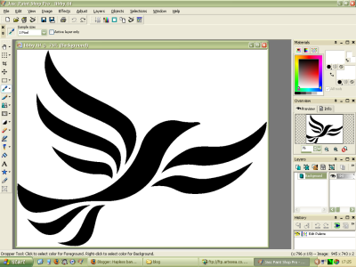
  • Step One: Start with a large 1 bit TIF file (you can download the one I use here).
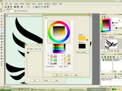
  • Step Two: Edit the palette (Image -> Palette -> Edit Palette… [Shift+O]) to the background and foreground colours that you want.

    The hex values for the bird I recommend are:
    Black – #00000, Gold – #ffcc33 or Orange – #ff9900.
  • Step Three: Increase the colour depth to 16 million colours (Image -> Increase Color Depth -> 16 Million Colors (24 Bit) [Ctrl+Shift+0])
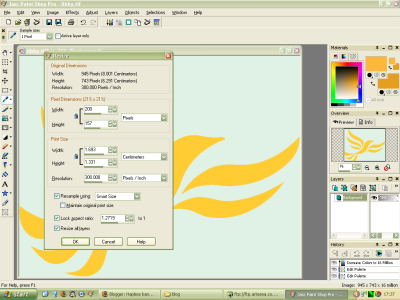
  • Step Four: Resize your image (Image -> Resize… [Shift+S])

    Ensuring that you’ve got Resample Using: set to Smart Size and Lock Aspect Ratio ticked.
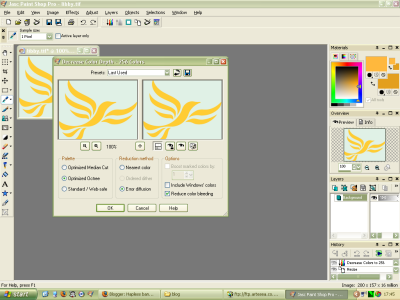
  • Step Five: Decrease your colour depth to 256 colours (Image -> Decrease Color Depth -> 256 Colors (8 Bit) [Ctrl+Shift+3])

    Ensuring that you have the following settings set:
    Palette: Optimized Octree
    Reduction Method: Error diffusion
    Options: Reduce color bleeding
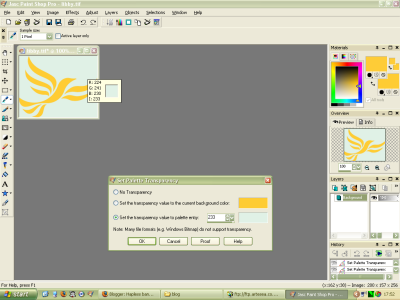
  • Step Six: Set the palette transparency (Image -> Palette -> Set Palette Transparency… [Ctrl+Shift+V])

    To get the right palette entry, just click on the background of the image.
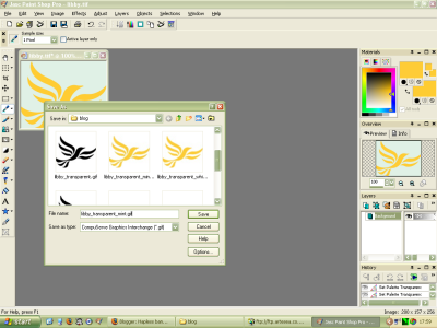
  • Step Seven: Save your file as a GIF (File -> Save As… [F12]) and try to call it something useful either a colour description (libby_mint_transparent.gif) or based on the pixel size (libby_200_157.gif) so that you know what the image is about when looking at your image folder.
  • Step Eight: You now have the perfect transparent Libby
  • Note: If you don’t want a transparent GIF, then stop after step four and save your image as a PNG (Portable Network Graphics), or after step five and save as a GIF.

If you still find this too hard (or don’t have the software), for a small donation I’ll knock one up for you, just let me know where on your website you want it to go, and what size it needs to be. (The same goes for any logo or image that you want).

New Logo, New Colours

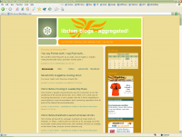
Having kept the same style for over a year now, I felt it was time to make some changes.
New LogoHaving seen Will’s new title, I wanted one of my own. I tried photoshoping a picture that I had seen, then I remembered that I’m crap at stuff like that. However I then discovered how Will had done it, and just copied him. It’s a great site called LetterJames. They have translated from German to English, however you do find the odd bit still in German (including the receipt).
Having picked my new logo, next was to change the colours. I had got fed up of the browns, so I got the colour picker in Paint Shop Pro to find some colours from the new logo. After several hours I managed to get the combination I’ve gone for, it’s a green, mint and lemon mix.
For the time being I’m going to keep the text the same colour as before, but over the next few weeks that might change too.
Having changed the logo and colours, the next step was to remove the curves and arrows that I didn’t really like. I decided to replace the bullets with the asterisk like those in the logo, which seems to be working well.
The final stage was to create a new favicon, for those of you who use Internet Explorer you don’t really see them, however for Firefox it’s worth working on one.
I kept to the asterisk theme and cropped one from the logo, then using this webpage I converted a png file to a ico.
It’s the same website which I used to create the LibDemBlog one, which I think is the nicest LibDem favicon available (feel free to steal for your own site).

Just a quick note, whilst doing the redesign, I did notice a small problem with the search engine. It seems that Google is playing up and that results are only being returned around 20% of the time. If you do want to search, just keep trying.
LibDemBlog Stuff

As I guessed there have been troubles since DataFlame switched my sites to a new server. The main problem seems to be that my cron jobs aren’t running. The cron job is used to generate the half hourly versions of LibDemBlogs, so if it hasn’t updated for a while it’s because I’ve not manually poked it.
I’ve also modified the code slightly so that it only shows posts that were posted before now. This means that “future” posts are ignored. If you find these are your, please make sure that you date settings are set to either GMT or BST.